
Shadcn UI visual regression testing with storybook
/ 8 min read
Last Updated:Introduction
This is a practical guide to Tailwind, shadcn-ui Visual Regression Testing with Storybook. It will walk you through the basics of integrating Tailwind & shadcn-ui, managing components with Storybook, and ensuring visual consistency using Lost Pixel’s open-source visual regression testing. Perfect for developers at any level, this guide offers a straightforward approach to enhancing your Next.js or any other projects using different frameworks. Let’s dive in!
Getting started
Clone the next.js template from shadcn-ui-next-js template and download it on your machine. We start with npm install to get all of the dependencies running. npm run dev starts the next project and sets us up for the next steps.
What are we going to do:
- Add couple of components using shadcn-ui
- Add storybook to manage the components we created
- Add lost-pixel open-source visual regression testing flow to make sure our components are always looking as expected
Extending our component base
We will create the patterns folder where we will put our new components that we will want to test. Don’t forget to addon all of the primitives like label,switch and other trough amazing shadcn cli
Our first component will be <Cookies/>
"use client"
import { Button } from "../ui/button"import {  Card,  CardContent,  CardDescription,  CardFooter,  CardHeader,  CardTitle,} from "../ui/card"import { Label } from "../ui/label"import { Switch } from "../ui/switch"
export function DemoCookieSettings() {  return (    <Card>      <CardHeader>        <CardTitle>Cookie Settings</CardTitle>        <CardDescription>Manage your cookie settings here.</CardDescription>      </CardHeader>      <CardContent className="grid gap-6">        <div className="flex items-center justify-between space-x-2">          <Label htmlFor="necessary" className="flex flex-col space-y-1">            <span>Strictly Necessary</span>            <span className="font-normal leading-snug text-muted-foreground">              These cookies are essential in order to use the website and use              its features.            </span>          </Label>          <Switch id="necessary" defaultChecked />        </div>        <div className="flex items-center justify-between space-x-2">          <Label htmlFor="functional" className="flex flex-col space-y-1">            <span>Functional Cookies</span>            <span className="font-normal leading-snug text-muted-foreground">              These cookies allow the website to provide personalized              functionality.            </span>          </Label>          <Switch id="functional" />        </div>        <div className="flex items-center justify-between space-x-2">          <Label htmlFor="performance" className="flex flex-col space-y-1">            <span>Performance Cookies</span>            <span className="font-normal leading-snug text-muted-foreground">              These cookies help to improve the performance of the website.            </span>          </Label>          <Switch id="performance" />        </div>      </CardContent>      <CardFooter>        <Button variant="outline" className="w-full">          Save preferences        </Button>      </CardFooter>    </Card>  )}
Second component will be <CreateAccount/>
"use client"
import { Icons } from "@/components/icons"
import { Button } from "../ui/button"import { Card, CardContent, CardDescription, CardFooter, CardHeader, CardTitle,} from "../ui/card"import { Input } from "../ui/input"import { Label } from "../ui/label"
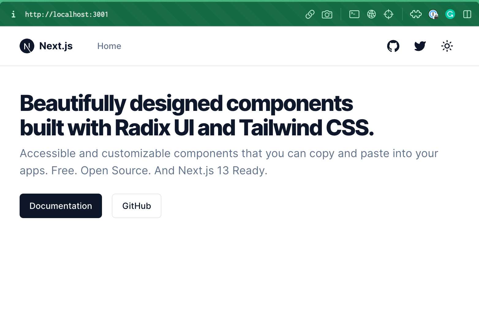
export function DemoCreateAccount() { return ( <Card> <CardHeader className="space-y-1"> <CardTitle className="text-2xl">Create an account</CardTitle> <CardDescription> Enter your email below to create your account </CardDescription> </CardHeader> <CardContent className="grid gap-4"> <div className="grid grid-cols-2 gap-6"> <Button variant="outline"> <Icons.gitHub className="mr-2 h-4 w-4" /> Github </Button> <Button variant="outline"> <Icons.twitter className="mr-2 h-4 w-4" /> Twitter </Button> </div> <div className="relative"> <div className="absolute inset-0 flex items-center"> <span className="w-full border-t" /> </div> <div className="relative flex justify-center text-xs uppercase"> <span className="bg-background px-2 text-muted-foreground"> Or continue with </span> </div> </div> <div className="grid gap-2"> <Label htmlFor="email">Email</Label> <Input id="email" type="email" placeholder="m@example.com" /> </div> <div className="grid gap-2"> <Label htmlFor="password">Password</Label> <Input id="password" type="password" /> </div> </CardContent> <CardFooter> <Button className="w-full">Create account</Button> </CardFooter> </Card> )}Adding those to the page should look similar to this:
Now let’s add Storybook to our project and add our patterns & primitives to our storybook so we could develop them in isolation, document & most importantly test them.
Adding storybook
Storybook is indespensable tool for modern frontend development as it allows to document the components, develop them in isolation & finally easily test them for visual regression testing.
Let’s run this command to automatically enable the storybook in our project npx sb init --builder webpack5. Next we need to make sure that storybook works well with the tailwind which is used under the hood of shadcn.ui.
npx storybook@latest add @storybook/addon-styling-webpack
We will override our font in globals.css so that our fonts in both storybook and application are the same, so this tutorial is simpler to follow.
@layer base { * { @apply border-border; } body { @apply bg-background text-foreground; font-feature-settings: "rlig" 1, "calt" 1; font-family: "Inter", sans-serif; }}Let’s add 3 stories of the tailwind component that we have. One primitive component - <Button/> and two pattern components - <Cookies/> & <CreateAccount>.
In the stories folder that we have automatically created let’s delete all of the generated files & add our own.
import type { Meta, StoryObj } from "@storybook/react"
import { DemoCreateAccount } from "../components/patterns/create-account"
const meta: Meta<typeof DemoCreateAccount> = {  component: DemoCreateAccount,}
export default metatype Story = StoryObj<typeof DemoCreateAccount>
/* *👇 Render functions are a framework specific feature to allow you control on how the component renders. * See https://storybook.js.org/docs/react/api/csf * to learn how to use render functions. */export const Primary: Story = {  render: () => <DemoCreateAccount />,}
import type { Meta, StoryObj } from "@storybook/react"
import { DemoCookieSettings } from "../components/patterns/cookies"
const meta: Meta<typeof DemoCookieSettings> = { component: DemoCookieSettings,}
export default metatype Story = StoryObj<typeof DemoCookieSettings>
/* *👇 Render functions are a framework specific feature to allow you control on how the component renders. * See https://storybook.js.org/docs/react/api/csf * to learn how to use render functions. */export const Primary: Story = { render: () => <DemoCookieSettings />,}import type { Meta, StoryObj } from "@storybook/react"
import { Button } from "../components/ui/button"
const meta: Meta<typeof Button> = { component: Button,}
export default metatype Story = StoryObj<typeof Button>
/* *👇 Render functions are a framework specific feature to allow you control on how the component renders. * See https://storybook.js.org/docs/react/api/csf * to learn how to use render functions. */export const Primary: Story = { render: () => <Button>Primary button</Button>,}Note that our primitive component is used in both of the pattern components, this is important for the visual regression testing, as with growth of your component library the biggest risk lies in changing the primitives & affecting your patterns where those primitives are used.
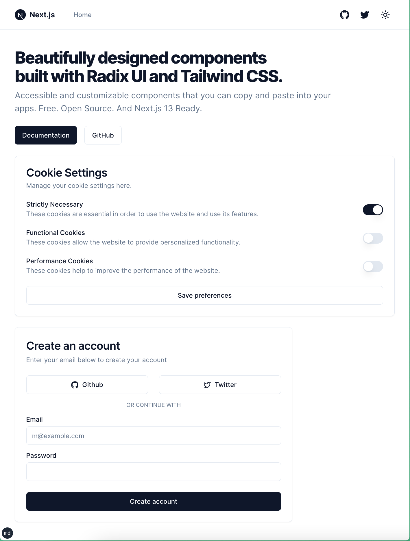
Our end result should look like this:
Let’s add a simple visual regression testing for our tailwind & shadcn-ui.
Adding Lost Pixel
Let’s add Lost Pixel package to our repo:
npm add lost-pixel && npx lost-pixel init-ts
Our lostpixel.config.ts should me slightly modified to ensure we target storybook at the correct place.
import type { CustomProjectConfig } from "lost-pixel";
export const config: CustomProjectConfig = {  storybookShots: {    storybookUrl: "./storybook-static",  },  generateOnly: true,  failOnDifference: true,};
Believe it or not - this is the basic working visual testing setup with Lost Pixel, the only thing that we need to do is to build our storybook & run lost-pixel!
npm run build-storybook && npx lost-pixel update
This will build our storybook & then run lost-pixel tests over it & place the current component visual snapshots into .lost-pixel folder.
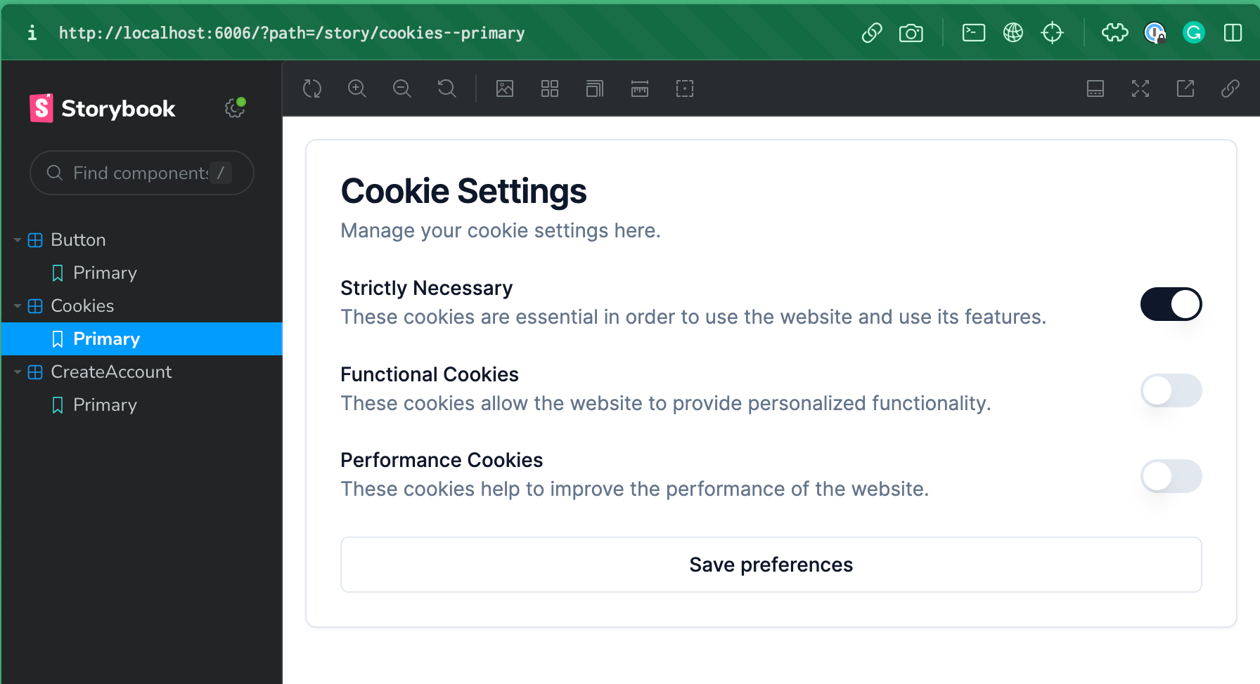
Now let’s try to change the <Button/> primitive and rerun our tests, let’s change default background from primary to destructive
default: "bg-destructive text-primary-foreground hover:bg-primary/90"
npm run build-storybook && npx lost-pixel
Comparing 3 screenshots using 'pixelmatch' as compare engine
[1/3] Comparing 'button--primary' (button--primary)[2/3] Comparing 'cookies--primary' (cookies--primary)[3/3] Comparing 'createaccount--primary' (create-account--primary)
[1/3] Difference of 4726 pixels (0.51%) found. Difference image saved to: .lostpixel/difference/button--primary.png (button--primary)[2/3] No difference found. (cookies--primary)[3/3] Difference of 47364 pixels (5.14%) found. Difference image saved to: .lostpixel/difference/create-account--primary.png (create-account--primary)
Comparison done!
We can see that in both of the pattern components that were using the <Button/> with primary variant we have the spotted regressions. All the relevant to the run images are saved in .lost-pixel folder.
This is a very basic setup that allows you to run visual regression tests locally. Let’s add a simple GitHub actions integration to make sure we can catch the visual regressions of our tailwind components continuously & effortlessly.
Running visual regression testing on GitHub Actions
To start running Lost Pixel on CI we need to create an action workflow file. Let’s create .github folder, and place workflows folder inside. Inside workflows let’s create vrt.yml file with the following contents:
on: [push]jobs:  build:    runs-on: ubuntu-latest
    steps:      - name: Checkout        uses: actions/checkout@v3
      - name: Setup Node        uses: actions/setup-node@v3        with:          node-version: 18.x          cache: "npm"
      - name: Install dependencies        run: npm install
      - name: Build Storybook        run: npm run build-storybook
      - name: Lost Pixel        uses: lost-pixel/lost-pixel@v3.7.4
This code checks out repository, installs dependencies, builds storybook & finally runs Lost Pixel. If there will be visual regressions the check will fail.
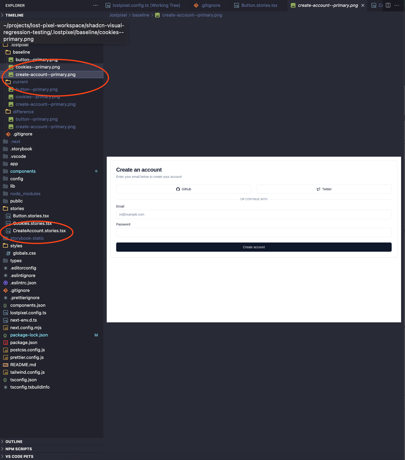
Whenever you make a change to your stories that should update the baselines - just run npx lost-pixel docker update. This will run lost-pixel in docker to make sure we eliminate inconsistencies in operating systems between your machine & CI, it will also update all of the visual snapshots in the baseline folder of .lost-pixel making your next CI run successful.
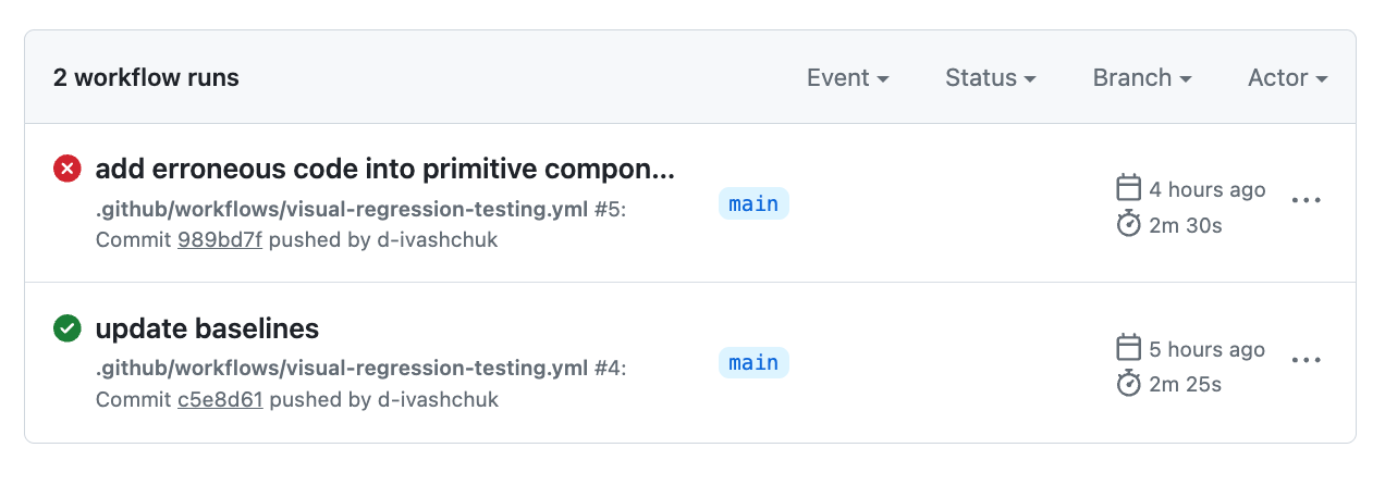
That’s the result we are aiming for here for when you are pushing some code that changes your primitive components and influences other patterns down the dependency graph:
If you want to extend your storybook visual tests & add your Next.js pages - it’s super trivial with Lost Pixel as well, you can follow this tutorial that focuses on holistic tests